Public bathrooms 🤝 Liquid Glass
How public bathrooms in Tokyo could improve the design and usability Liquid Glass in iOS 26
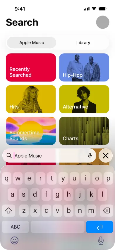
Quick! Find the active UI element in the Apple Music screens below. If it took you more than a second or you couldn’t spot it, you’re not alone.
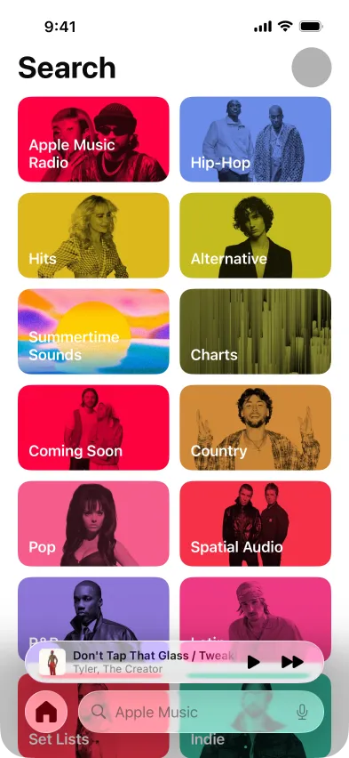
Also, it’s a trick question. Because even though you navigate to this screen by tapping the search button, there’s nothing active on landing and it’s not immediately clear what you should do next.
I don’t know about you, but when I tap search, I expect the search field to have focus. Or, at a minimum, I don’t expect to hunt for the search field. But this usability flaw paired with Liquid Glass and its low contrast aesthetic—especially when it’s on a busy background—frustrates me every time I land on this screen.
I’m here to share an idea that honors the core concepts of Liquid Glass, but extends the metaphor to demonstrate a relatively easy way to create a more usable UI.
Inspiration from the real world
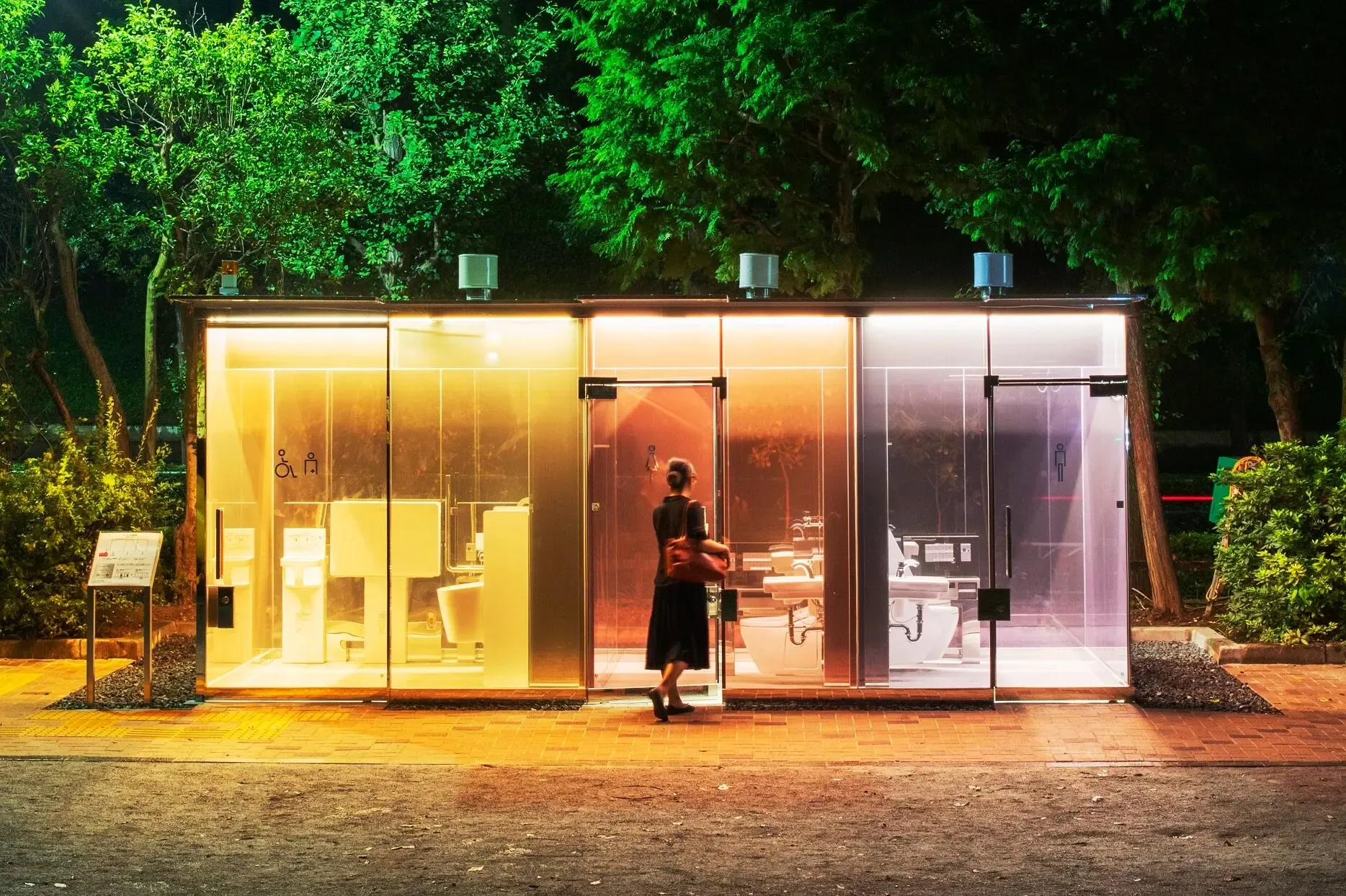
Let’s start with a real-world example. This is a public bathroom in Tokyo. Note the clear, colorful glass. Clear glass and public bathrooms seem like an odd combination. But as soon as you lock the door, the glass becomes opaque, giving you privacy and clearly signaling the bathroom is in use. There are usability issues with this solution (and lots of user skepticism), but let’s focus on a key concept: when you demonstrate your intent to use the bathroom by locking the door, your action results in a clear change in the material. It’s a state change that reflects the needs and goals of the user.
Making liquid glass smarter
Let’s consider how applying a key concept from Tokyo’s smart glass bathrooms could improve Apple’s Liquid Glass UX. When you signal an intent, like tapping the search button in Apple Music, let’s see what it might look like to change the UI to reflect your needs and goals.
Current state
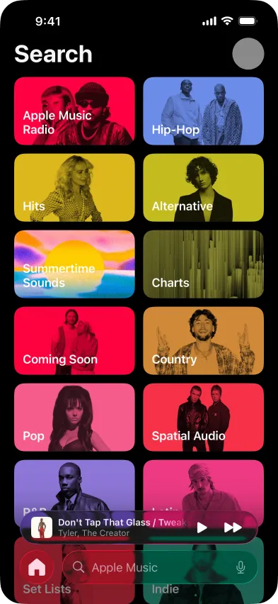
With a more visible search bar
In this example, I’ve made two small changes. First, I’ve made the search bar almost opaque. It’s not fully opaque like the public bathrooms in Tokyo, but in this context, the change adds enough visual contrast with the competing elements to make the search bar clearly visible. Second, I made the text darker, which provides an accessible level of contrast.
From a UX perspective, these changes make the key action (search) clearer without distracting from other content on the screen. And if your intent changes—say you start to scroll through the genres—the search bar could respond to that action and change to a low-contrast, transparent state.
One more thing
Exploring iOS 26, design patterns from Photos and Mail point to an even better solution. You tap the search icon and you see… an active search field. Wow!
Let’s see how that might look in Apple Music. It’s worth noting this screen does have a complex set of options, including a toggle to search Apple Music or your library, listing recent searches, and highlighting popular genres. However, defaulting to an active search field doesn’t get in the way of these options, and it makes searching much easier.
Current state
What if active search was the default?
I know Liquid Glass will continue to evolve. I hope this demonstrates how cues from the real world can improve the UX while honoring the core concepts of the new UI.